{{domainAddress}}/customData/getConfig
Important: This function must be requested before the following UIs are accessed:
- Registration of a new user (some registrations require the collection of this additional data)
- Displaying a customer’s previously collected data
The response to this request provides the contents and configuration of data collection components. This data has no purpose within Mosaic’s system functionality but is collected at the request of clients for their business purposes.
The type of data required by clients varies so Mosaic created this feature to give clients the ability to create and customize data collection. Mosaic will use UIs during registration and in the user’s profile section to collect, present, and edit customer responses.
Headers
| Header | Content |
| Content Type | application/json |
| Authorization | Bearer {{ID token}} |
| App-Id | {{API key provided by Mosaic}} |
| Device-Id | {{Advertising ID from the initial installation of this app}} |
| Request-Date | {{ISO 8601 date and time format in UTC}} |
Body
This function requires the clientId provided by Mosaic for this app to be sent in the request payload.
{
    "clientId": "{{clientId}}"
}
Example
Headers
App-Id: 5***9-d**3-4**8-b**1-b3***dac
Device-Id: a4***cb-d***5-4***f-8***c-84***75
Request-Date: 2024-07-02T19:59:20.815Z
Content-Type: application/json
Authorization: Bearer eyJraWQiO...aLxlc6PCgQ
Body
{
    "clientId": "11rnjt7g1jvgpgsj0"
}
Response
Retain the response.data contents in local storage.
This sample response contains data for three different types of data collection fields:
- Text input only
- Drop menu only
- Combined Text and drop menu
{
  "errors": [],
  "warnings": ["Validator: 1 value was removed from the provided request data"],
  "notices": [],
  "data": {
    "fields": [
      {
        "addButtonText": "ADD ANOTHER+",
        "fieldName": "Text Input",            <-- TEXT INPUT SAMPLE
        "subFieldA": {
          "allowCopies": false,
          "alpha": true,
          "options": " ",
          "numbers": true,
          "subType": "text",
          "maxChars": 10,
          "placeHolderText": "Text Input",
          "symbols": true,
          "optionsArray": []
        },
        "allowMultiple": true,
        "appUIs": ["register", "profile"],
        "id": "field1",
        "subFieldB": {},
        "fieldType": "text",
        "mandatory": true
      },
      {
        "addButtonText": "ADD ANOTHER+",
        "fieldName": "Dropdown",            <-- DROPDOWN MENU SAMPLE
        "subFieldA": {
          "allowCopies": true,
          "alpha": false,
          "options": "Option A:A\nOption B:B\nOption C:C\nOption D:D",
          "numbers": false,
          "subType": "drop",
          "maxChars": 10,
          "placeHolderText": "Dropdown",
          "symbols": false,
          "optionsArray": [
            {
              "value": "A",
              "display": "Option A"
            },
            {
              "value": "B",
              "display": "Option B"
            },
            {
              "value": "C",
              "display": "Option C"
            },
            {
              "value": "D",
              "display": "Option D"
            }
          ]
        },
        "allowMultiple": true,
        "appUIs": ["register", "profile"],
        "id": "field2",
        "subFieldB": {},
        "fieldType": "drop",
        "mandatory": true
      },
      {
        "addButtonText": "ADD ANOTHER+",
        "fieldName": "Combo",            <-- TEXT WITH DROPDOWN SAMPLE
        "subFieldA": {
          "allowCopies": false,
          "alpha": true,
          "options": " ",
          "numbers": true,
          "subType": "text",
          "maxChars": 10,
          "placeHolderText": "Text Input",
          "symbols": true,
          "optionsArray": []
        },
        "allowMultiple": true,
        "appUIs": ["register", "profile"],
        "id": "field3",
        "subFieldB": {
          "allowCopies": true,
          "alpha": false,
          "options": "Option 1:1\nOption2:2\nOption3:3\nOption4:4\nOption5:5",
          "numbers": false,
          "subType": "drop",
          "maxChars": 10,
          "placeHolderText": "Dropdown",
          "symbols": false,
          "optionsArray": [
            {
              "value": "1",
              "display": "Option 1"
            },
            {
              "value": "2",
              "display": "Option2"
            },
            {
              "value": "3",
              "display": "Option3"
            },
            {
              "value": "4",
              "display": "Option4"
            },
            {
              "value": "5",
              "display": "Option5"
            }
          ]
        },
        "fieldType": "combo",
        "mandatory": true
      }
    ],
    "lastFieldId": 3
  }
}
—Common Field Object Content
The “response.data.fields” array contains a separate object for each of the data collection components required by the client. Each object will contain the data required to display and validate the input field contents.
Each type of input object contains standard properties. These are the same across all input types and perform the same function—to dictate how these inputs can be used.
{
      "id": "field1",
      "fieldType": "text",
      "mandatory": true
      "appUIs": ["register", "profile"],
      "fieldName": "Text Input",
      "subFieldA": {...},  <-- this primary input field will always exist
      "subFieldB": {...},  <-- will only be populated in a combination field
      "allowMultiple": true,
      "addButtonText": "ADD ANOTHER+",
}
| property name | type | description |
|---|---|---|
| “id” | string | identifies the field |
| “fieldType” | string | defines the type of input component to present on the screen options: “text”, “drop”, “combo” |
| “mandatory” | boolean | defines whether this field is mandatory or optional; if TRUE, then this field cannot be left empty and must prevent submission to the API. |
| “appUIs” | array of strings | identify in which UIs these input fields should be presented |
| “fieldName” | string | this is the text that will be presented as a caption for this input component |
| “subFieldA” | object | contains the configuration data required for this input component; this object will always be populated |
| “subFieldB” | object | contains the configuration data required for this input component; this object will only be populated for “combo” components |
| “allowMultiple” | boolean | determines if a customer can add additional input components to the screen (example: the client wants to know the license plate of the customer’s vehicle. The customer has two vehicles and wants to include both plates. If TRUE, the customer can add another input component to the UI so that they can submit their second plate. |
| “addButtonText” | string | this is the text that will appear in the button that adds an additional input component (if “allowMultiple” is true). |
—Text Input
The text input field components have one user-interactive element—a text input box.
“subFieldB” will be an empty object: { }.
“subFieldA” will contain the configuration information for that text input box.
"subFieldA": {
      "subType": "text",
      "placeHolderText": "Text Input",
      "allowCopies": false,
      "alpha": true,
      "numbers": true,
      "symbols": true,
      "maxChars": 10,
      "options": " ",
      "optionsArray": []
}
| property name | type | description |
|---|---|---|
| “subType” | string | “text” indicates that this is a text input field |
| “placeHolderText” | string | the string that should pre-populate an empty input field, preferably in the background and is replaced by the customer’s input |
| “allowCopies” | boolean | indicates whether the customer’s input can be repeated in other text input fields (example: the field requests a license plate and the customer creates multiple instances of a text input component to add more than one plate; if this is TRUE, then the customer can input the same plate into multiple input boxes but if FALSE the customer should be prevented from duplicating input data. |
| “alpha” | boolean | determines whether alphabetical characters are permitted in the input field |
| “numbers” | boolean | determines whether numbers are permitted in the input field |
| “symbols” | boolean | determines whether symbols are permitted in the input field |
| “maxChars” | small integer | specifies the maximum number of characters the customer can input |
| “options” | string | will always be an empty string for text input fields |
| “optionsArray” | array of objects | will always be an empty object for text input fields |
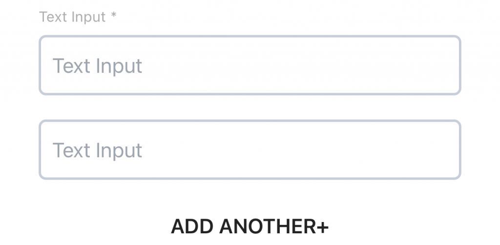
The image below shows a mandatory text input field where “allowMultiple” is TRUE and the customer has already created a second instance of the original text input field, with the option to ADD ANOTHER if they need to.
—Dropdown Menu
Dropdown menu components have one user-interactive component—a dropdown menu.
“subFieldB” will be an empty object: { }.
“subFieldA” will contain the configuration information for that dropdown menu.
"subFieldA": {
      "subType": "drop",
      "placeHolderText": "Dropdown",
      "allowCopies": true,
      "alpha": false,
      "numbers": false,
      "symbols": false,
      "maxChars": 10,
      "options": "Option A:A\nOption B:B\nOption C:C\nOption D:D",
      "optionsArray": [
            {
              "value": "A",
              "display": "Option A"
            },
            {
              "value": "B",
              "display": "Option B"
            },
            {
              "value": "C",
              "display": "Option C"
            },
            {
              "value": "D",
              "display": "Option D"
            }
      ]
}
| property name | type | description |
|---|---|---|
| “subType” | string | “drop” indicates that this is a dropmenu component |
| “placeHolderText” | string | the string that should pre-populate an empty input field, preferably in the background and is replaced by the customer’s selection |
| “allowCopies” | boolean | indicates whether the customer’s selection can be repeated in other dropmenu fields (example: the field requests the customer’s favourite carwash location from a list of location options; if this is TRUE, then the customer can select the same location within multiple input boxes but if FALSE the customer should be prevented from duplicating the same selection. |
| “alpha” | boolean | does not apply and will always be FALSE for dropmenu components |
| “numbers” | boolean | does not apply and will always be FALSE for dropmenu components |
| “symbols” | boolean | does not apply and will always be FALSE for dropmenu components |
| “maxChars” | small integer | does not apply to dropmenu components |
| “options” | string | a stringified version of the “optionsArray”. This value is used by the Operator’s website and can be ignored by the mobile apps. |
| “optionsArray” | array of objects | each option in the drop menu will have a separate object detailing the text that will be displayed in the drop menu, and the value of the selected text. |
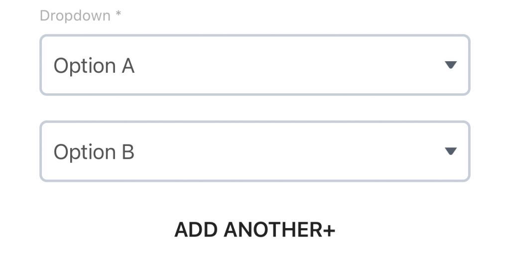
The image below shows a mandatory dropdown menu where “allowMultiple” is TRUE and the customer has already created a second instance of the original dropdown menu, with the option to ADD ANOTHER if they need to.
—Combination (Text and Dropdown)
Combination components have two user-interactive elements, both of which can be text input fields or dropdown menus.
“subFieldA” can be either a text input field or a dropdown menu and this object will contain the configuration information for whichevery type has been specified.
“subFieldB” can be either a text input field or a dropdown menu and this object will contain the configuration information for whichevery type has been specified.
The “subField” object contents will reflect the type of input specified (see Text Input and Dropdown Menu sections above for details.
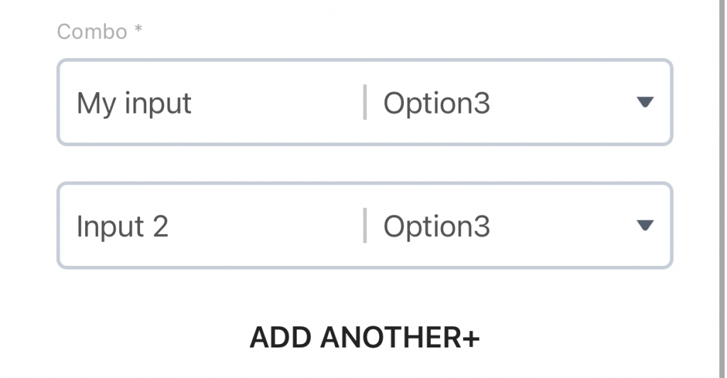
The image below shows a mandatory combo input component with one text input field and one dropdown menu. “allowMultiple” is TRUE and the customer has already created a second instance of the original text input field, with the option to ADD ANOTHER if they need to.
Error Codes
Important: To determine whether or not to parse the response.data object as a successful response, or an error response, examine the errors array. If its length is greater than zero, then the data contains an error data structure.
—Authentication Errors
All API functions are subject to possible authentication errors. These are consistent across all function and are described in the Authentication post.
| API Response | Cause |
| response: { “message”: “Unauthorized” } | Incorrect headers or header contents. Contact Mosaic Developers to resolve this issue. |
| response.data:{ “message”: “Access Token has expired”, “code”: “NotAuthorizedException“, “statusCode”: 400, “retryable”: false } | Refresh tokens The access token previously recorded is no longer valid, and must be refreshed. The “message” will explain what went wrong. |
